
Level: Waterpark


Design Challenge: How do I create a PvP arena that allows players to find each other quickly while still giving players carrying vulnerable pets opportunities to hide/escape?
Answer:
-
Asymmetrical arena with two main levels of elevation
-
Balancing of a) open sightlines for player discovery and chase with b) large occluding geometry for evasion and escape
-
Open central area that spawns lots of coins to entice mosh-pit fighting
-
Hiding spots in nooks, crannies, corners, and under waterfalls
-
Plenty of platforming opportunities
Level Art, Theme, and Layout Research
I consulted with Michaela Nienaber, our art director, for guidance on how to imbue this level with a strong environmental identity. We discussed different options, such as zoos or a factory floor. In the end, we negotiated a vision of a water park level because it would be a bright, joyful environment to complement the suite of tonally varied levels we needed to have.
In terms of level art, challenge of this particular level was that the art department did not have scope to build new environment art. It was incumbent on me to make much of the level from Roblox parts and simple meshes in Blender, as well as re-use environmental assets from other games created by the studio.
I gathered reference images to inform the possible outcomes for the final layout and look of the level.
Open central pool where aggressive players can get each other

Higher elevation above and around central pool for more cautious players to evade and protect their pets

Geometry such as ramps and slides that fit the context of the environment

Design Logic & Prototyping

Spawn Point
Spawn Point
Spawn Point
Spawn Point
Spawn Point
-
For metrics, I set the scale of the level by creating a square floor 255x255 studs wide and building within it.
-
Another note about metrics was that the player's max horizontal jump length was about 9 studs, so I made sure that every gap that was intentionally designed for platforming was between 4-8 studs in length.
-
Blocked out the primary lanes circulating around the level using grid materials to measure the scale of objects
-
Higher upper lanes (blue) and lower lanes (yellow)
-
-
Added ramps and boxy geometry so players can easily access the higher lanes from below
-
Raised geometry to occlude certain sightlines and raise tension
-
Raised outer boundaries to envelop the level.
-
Created hiding spots (alcoves, nooks, and small rooms) to hide pets.
-
Add 8 spawn points spread throughout level, ensuring players aren't too close when game starts.

Players who want to hide their pets out of sight may do so inside these structures
Platforming opportunities would make traversal more challenging, let players carrying their pets to evade hunters if the hunter fails to make a jump
Designing this level was a balancing act of open lanes for players to find each other while establishing occluding structures so players may also "juke" each other and lose someone that's chasing them and their pet

This platform where the player is standing would have provided good sight lines over the level but eventually it was cut.
Testing
Once I had enough to test with, I organized playtesting sessions with the team where I learned the following:
-
Overall layout was solid since players enjoyed moving through the level
-
Players liked the platforming opportunities but the gaps needed to be mobile friendlier
-
The narrow platforms were much too challenging on either mobile or desktop

Per the feedback I received, I also narrowed some of the gaps all across the level to make it easier for player on mobile to platform back and forth
Whereas at first, some narrow walkways were intentionally challenging, playtesting and feedback determined that it was too punishing on mobile, so eventually I thickened/widened certain platforms and other geometry.
Example: I widened these walkways, which were indented to be risky if you fell but rewarding if the person chasing you and your pet fell off, from 1 stud wide to 3 studs wide.

Before
[1 stud wide]
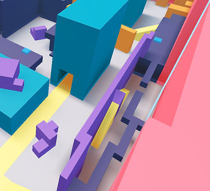
After
[3 studs wide]
Set Dressing Process
I normally start set dressing at the macro level by bringing in large, noticeable hero assets that serve as focal points for the players to orient themselves.

Notice how this "waterpark" is beginning to take on distinct sections: sandy beach bluffs and rocky ship dock
Pool tile flooring and water slides help to sell the overarching theme of the level
My goal during set dressing is to give geometry context: for instance, I contextualize narrow walkways with water tubes
Given that water parks are theme parks, and theme parks can have distinct areas, I decided to differentiate parts of the level from each other: an icy area, a sand castle area, and a rocky pirate area. Here's a playthrough:

The intent of the pirate ship was to allow players to orient themselves almost anywhere in the level with a tall, conspicuous shape, but we later changed it to a sand castle to even out the presence of the beach compared to the rocky/ship dock sections
At the micro-level, I bring in player-sized props such as wall decorations and pool chairs to sell the environmental theme.


I made sure to make room for hiding spots within large occluding structures like this ice castle
Cuts and Refinements
-
Problem: Too much occlusion
-
Hypothesis: Central landmark provides level-wide orientation
-
Test: Remove landmark during playtests
-
Result: Better sightlines
-
Secondary benefit: More space for coin spawning
-
Decision: Ship the level without landmark

Towards the latter playtests before shipping this level into the live game, the game designer had one more piece of advice: cut the large central landmark (first a pirate ship then changed to sand castle) to improve sightlines so players can better see across a map that already had plenty of large, occluding geometry.
As level designer, I was asking myself: How much visibility should the player have?
Too open:
Players find each other too easily → less opportunity for evasion.
Too closed:
Players can't find each other → PvP pacing suffers.
As much as I defended the design intent of how the sand castle served as a strong, central focal point to the level, I valued the player's experience above all else, and by testing the level without the sandcastle in the center, I concurred that cutting it would serve the overall goal of de-cluttering sightlines, ensuring players see each other and come into contact easier.


Cutting the sandcastle opened up a new possibility that was beneficial to the game...
...it allowed more space for coins to spawn, bringing players together so they can show off their weapons and pets in-action

After further polish and playtesting, including cutting a couple of walls, the end result is a cleaner, more streamlined arena.
